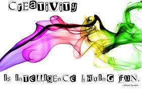
Stretch Your Creative Muscle
October 23, 2015 | Posted in Leading Hartfully, Living Hartfully | By Gaia Hart
Creativity is one of those things many people thing they don’t possess. They may have had it as a kid and it was “conformed out of them” in the academia and workplaces unless you chose a creative field. If you ask a room full of children if they can draw, all hands go up. If you ask a room of adults the same question, only a few hands raise. What’s the deal with that? When did we lose it? I think it’s still there, but hasn’t been exercised in a while and has become flabby.
When faced with unique conditions, I would like to think we could get creative and figure out a way just like the astronauts did when they were in trouble, or like Cheryl Strayed in her book Wild about hiking the Pacific Crest trail solo. I can relate to that after spending 30 days in the wilderness on an Outward Bound backpacking experience. Necessity is the not only the mother of invention, but I think the other child is creativity. I try to exercise my creativity daily through art, photographs, cooking, sewing, designing décor, designing training and activities, and problem solving. If I don’t get a chance to exercise my creative muscle, I get antsy and itchy to do something, anything creative.
The following are six conditions which allow creativity — and ultimately, innovation — to flourish.
Solitude. Not withdrawal or being totally alone, but in the sense of spending time apart from the clichés and conventions of society to focus on one’s own thoughts and ideas.
Inactivity. Not loafing or goofing off, but planned inactivity as a break in one’s busy routine. I’ve known people to regularly set aside part of their daily schedule so as not to be interrupted in their thoughts.
Daydreaming. Daydreaming can be focused on out of box thinking and is often connected to inactivity. In daydreams, we make mental excursions into fantasy that breed creative activity. Several organizations have quiet rooms set aside for the purpose of stimulating out-of-box thinking. Reading magazine outside your normal arena to get ideas from other industries is a fascinating way to daydream. I also find watching the house hunter home shows from around the world helps me get ideas.
Gullibility. This is the willingness to suspend one’s personal beliefs and accept what comes from inside without insisting on rationality or logic.
Alertness and discipline. Although these qualities are necessary for productivity in any endeavor, they also have a special meaning in creativity.
Mental replay. Allowing oneself to revisit past creative efforts and resolution of past traumatic conflicts leads to analogies.
While most of the conditions require loosening of control and openness to the inner self, the last and most important quality is the willingness to put whatever you discover into action. What are you going to put into action to exercise your creative muscle?
What Colors Can Do to Specialize Your Space and Affect Your Mood
November 8, 2013 | Posted in Living Hartfully | By Gaia Hart
Colors have a powerful effect on mood, and work their magic spell by helping us get in touch with our emotions. Colors can soothe, inspire, energize, and rejuvenate, and they set the mood and atmosphere of a room. So what is your home doing for you? Is your living room a drab den or a sensational salon? What about the bedroom? Is it a run-down retreat or a palace of passion? And what changes can you make to ensure that your living spaces are working for you? Understanding the rules of color and mastering the secrets of color mixing will help you create the right mood for your rooms. There are no rights and wrongs — the most important things are to have fun and to be creative. And the simplest way to revitalize your home is with paint.
Color wheel. Do you want warm or cool, dramatic or neutral? The color wheel is an invaluable tool for choosing the hues, tints, and shades based on your personal preferences. An unlimited amount of color combinations are possible. The wheel is divided into 12 equal sections, each displaying a primary, secondary, or tertiary color. The “warm” and “hot” colors are on the right hand side of the wheel, and the “cool” and “cold” colors are on the left. Black, white, and grey are the neutral colors, and don’t appear on the color wheel.
Primary colors. These are the three key colors that cannot be formed by any combination of other colors — red, blue, and yellow.
Secondary colors. When you mix equal amounts of two primary colors you get secondary colors — purple, green, and orange.
Red + Blue = Purple
Red + Yellow = Orange
Blue +Yellow = Green
Tertiary colors. Mixing primary colors with secondary colors in a 2:1 ratio will produce tertiary colors — red-orange, yellow-orange, red-purple, blue-purple, blue-green, and yellow-green.
How to use the color wheel:
Knowing the colors that harmonize and work with each other will help you create a tasteful theme and avoid making a rainbow riot. Here are some basic color schemes to get you started:
Complementary colors are found opposite each other, such as red and green or yellow and purple. They always go well together, hence the term complementary, and are easy on the eyes.
The meaning of colors:
Green. Bountiful in nature, the color green is life, growth, and health — a reassuring sign of renewal and regeneration. Situated in the center of the spectrum, green brings balance and order. The eye makes no adjustment to accommodate green striking the retina, making it a restful and soothing color.
Pink. Gentle and soft, delicate and feminine, pink quietly nurtures and soothes. It is the tender side of red, and invokes feelings of romance and enchantment. Bright pinks are energetic and youthful, while vibrant pinks are full of passion, though they are not as aggressive as reds.
Orange. Warm and sensuous, orange represents ripeness and happiness. It is a fun and exhilarating color that promotes feelings of excitement and hope. Orange is a combination of red and yellow, and shares common traits with both. It is forceful and demands attention, but is less intense than red, being mellowed by the presence of yellow.
Brown. Natural and organic, down-to-earth, and neutral. Though sometimes saddled with a reputation for being boring, brown is representative of wholesomeness and goodness, and promotes feelings of stability and order. It is simplicity in a chaotic world. Lighter shades are particularly soothing, while darker hues are confident and dependable.
Red. The color of passion, romance, love, and lust. Red is hot, fiery, and tempestuous — a powerful and intense color that evokes a sense of urgency and excitement, and stimulates the heart to beat faster. Red demands attention and will bring out the extrovert in you. It’s not for the shrinking violets.
Blue. Cool and calming, blue symbolizes serenity, purity, and loyalty. In many cultures blue has an important role in religious belief as a bringer of peace. Darker shades project an image of power and authority — police uniforms are blue, and a blue power suit is a favorite of the corporate world. Lighter shades are refreshing and uplifting — they encourage creativity and stimulate the imagination.
Purple. Full of magic and mystery, purple is the color of royalty, and represents opulence, wealth, luxury, and magnificence. Balancing hot red and cool blue, it has the properties of both. Purple can be uplifting, and is a soothing balm to mind and nerves. It also offers a sense of spirituality, and it symbolizes intuition and imagination.
Yellow. Representing the warmth and radiance of the summer sun, yellow is energetic, vibrant, cheerful, and optimistic. It’s the good mood hue, and shines with hope, happiness, and joy. Yellow enhances the intellect, activates the memory, and aids communication and concentration.
Upgrading your living spaces:
There are plenty of other ways to bring a burst of color into your life without the use of a paintbrush.
Living room
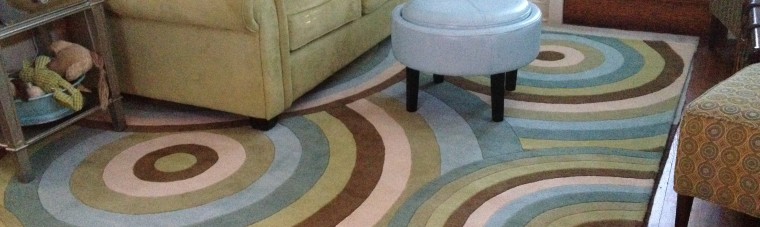
Use these additions to make your dream living room warm, cozy, and inviting. I found a wild rug and I mean wild in color and pattern and just HAD to have it. It so happens that it perfectly matched the cicles design on my chairs and my apple-green wild couch. Something happened on my way to being “of a certain age” that I replaced all my silk Chinese traditional dark green rugs with some crazy patterns and fun colors. Guessing I’m feeling like a freer spirit and can decorate however I want and this makes me happy…it’s light and luscious.
- Decorative throw pillows and cushions — add some fresh color and a touch of style and vitality.
- A colorful painting or digital photographs — take a few snaps in the park or around town, and frame the best images to create your own art.
- Colored pillar candles, plates, and vases — place on a sideboard or table, and think of grouping them in threes. Objects look more interesting in groups than on their own.
- Flowers — let nature enhance your living space.
Bedroom
- Your decision of whether you want your bedroom to be a passion palace or a blissful oasis will determine your color choice.
- Layer your room with linen — use embroidered sheets, satin quilts, pleated cotton bed skirts, and cozy and colorful drapes.
- Change the lighting — buy colored lampshades and painted light bulbs.
- Rugs — add to your room’s rich and lush appeal.
- Artwork — buy a huge canvas or print or hang your own creations.
Bathroom
Your bathroom is a serene sanctuary, and there are some simple ways of adding sparkle to your cool, calm oasis.
- Accessorize — consider a decorative mirror, colorful containers, pictures, matching towel sets, and decorative towel bars.
- A colorful rug — freshen up the floor.
- Color-changing faucet — provide quite literally a splash of color, as the water changes color as it runs through the faucet.
Colorful tricks
- To make a room appear larger — paint all surfaces with the same color from the warm end of the color wheel. Paint the ceiling a lighter shade to make it appear higher. Large furniture appears smaller if it is the same color as the walls.
- To make a room feel cozier — use colors from the warm end of the color wheel. A warm color on the ceiling will make it feel lower, and therefore comfier and more intimate.
Service & Self Care First, Clients Second

March 23, 2010 | Posted in Leading Hartfully, Living Hartfully | By Gaia Hart
Comments Off on Service & Self Care First, Clients Second
I know the saying is usually the customer comes first. But I have to take issue with that. Just like the oxygen masks from the ceiling, put your mask on first before you can help others.
If we serve and take care of ourselves first, taking care of our health, wealth and vitality, then it will resonate with others who are feeling the same way. If we are feeling burned out, rusted out and about to give out; what kind of clients do you think will resonate with that? If we are starving and struggling, how can we be feeding and leading? We must serve ourselves first in order to be strong, healthy and vital before we can show others the way.
Do we want to attract the low vibrational folk? Maybe we do, if our service is to help them raise their vibration. But the deal is, it’s not just clients you attract when you’re at a certain vibration, it’s everybody and everything.
We may have learned early on that taking care of ourselves first is selfish. I shout from the rooftops that we need to take care of ourselves and guard our energy fiercely, or else we won’t have any to give away. You can’t give what you don’t have. So we must have our vitality and energy first, then give it away to others and help them find their own.
For instance, creating is like breathing for me – it’s so reflexive. If I can’t be creating something, anything (articles, sewing, cooking, decorating, art, programs), I get antsy. That is why it’s critical for me to guard my morning time as fiercely as I guard a meeting with a VIP, by the way, that’s ANYBODY.
I know if I don’t get ‘me time’ to create, I’m cranky and I can’t rebuild my energy stores. I know my body rhythms and I’m the most creative in the morning and brain dead